
-
Click Cellular tab in the Reports screen.
-
The Cellular tab enables the user to view reports about the Cellular networks used by the users in their Edge devices. The user can use this information for further analysis and to make informed business decisions.
-
In the Organization field, select the Organization or sub-organization from the dropdown menu. The logged in admin Organization is populated by default here. This is the organization corresponding to the email ID used to login.
-
The dropdown list consists of all the sub-organizations under logged in admin organization.
-
Select the Sites from the dropdown menu.
-
The Cellular tab shows the data as shown in the below figure.
-20250821-125515.png?cb=45bfc39acbb97aa76c3768f6407293fc)
Table
The table shows the below information:
-
Site - Name of the site
-
Product ID / DID - Unique Identification code / Device Identification code
-
Provider - Name of the providers
-
IMEI - IMEI Number of the device
-
ICCID
-
Usage - Data consumed by the device
-
Status - Connection Status of the cellular device. The different types of status are:
-
ACTIVE - Device is Active
-
DEAC - SIM Deactivated - No monthly charges
-
INAC - SIM was never activated
-
SUSP - Temporary Suspension
-
WIP - There is a request sent to the Service Provider (Activation / Deactivation / Enquiry)
-
-
Last Reported - Last reported date and time
-
Last Seen - Last seen date and time
-
The filter option can be used to filter the table based on the Provider name or DID or ICCID and find the required entries.
-
Click the Filter By button and select the required option from the dropdown menu. The options available are Provider / DID / ICCID.
-
Enter the required Provider name or DID or ICCID and click the search icon. The table gets filtered and shows the suitable results.
-
Click the Download button to download the table data locally in CSV format.
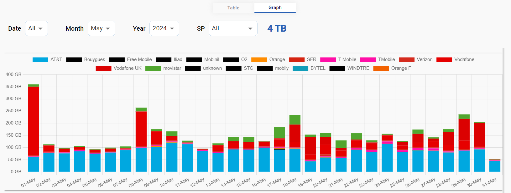
Graph
-
Click the Graph tab to view the cellular usage data in graphical format.
-
The Graph tab shows the data as shown in the below figure.
-
The user can further drill down and view the Cellular data usage by selecting the Date, Month, Year and Service Provider using the dropdown menus.
-
The Graph section shows a bar chart that depicts the amount of cellular data consumed at different time instances. The horizontal axis contains the time instances, and the vertical axis contains the amount of data consumed. The graph between these two axes gives the user a clear understanding of how the data has been consumed over the selected time period.
-
Scroll down to view the data usage chart based on the different sites of the selected organization.
-20240531-123425.png?cb=c3dfb879b7f522abb87653648bc08bf3)